Grateful
Dead
Skeleton
Grateful
Dead
Skeleton
Grateful
Dead
Skeleton

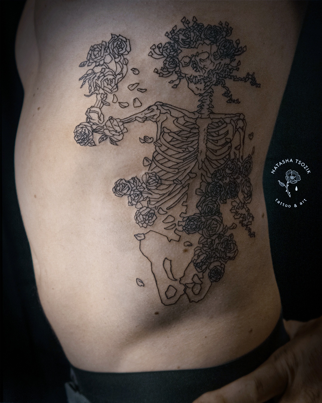
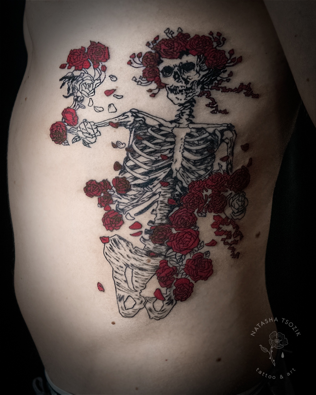
Large graphic project for C., a tribute to the Grateful Dead band. For this project, I needed to put in a great amount of work and time, taking into account the wishes and anatomy of the client. During the research, I discovered quite a few interesting facts about the band's art. You cannot remain indifferent to their colorful covers and posters, especially if you live in San Francisco (the rock band formed in 1965 in Palo Alto, California).
The image of a skeleton actually has an interesting story. In media, it's mostly known as a distinctive sign of the Grateful Dead. But it was born long ago before the band.
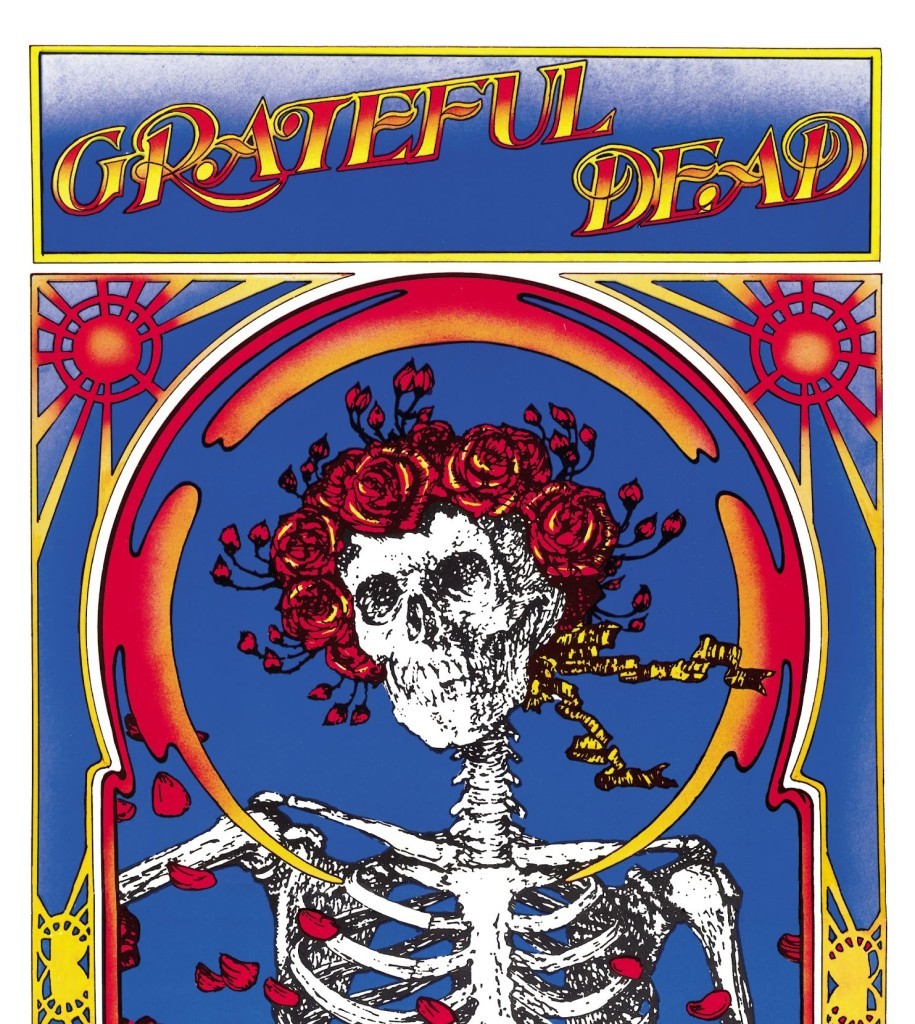
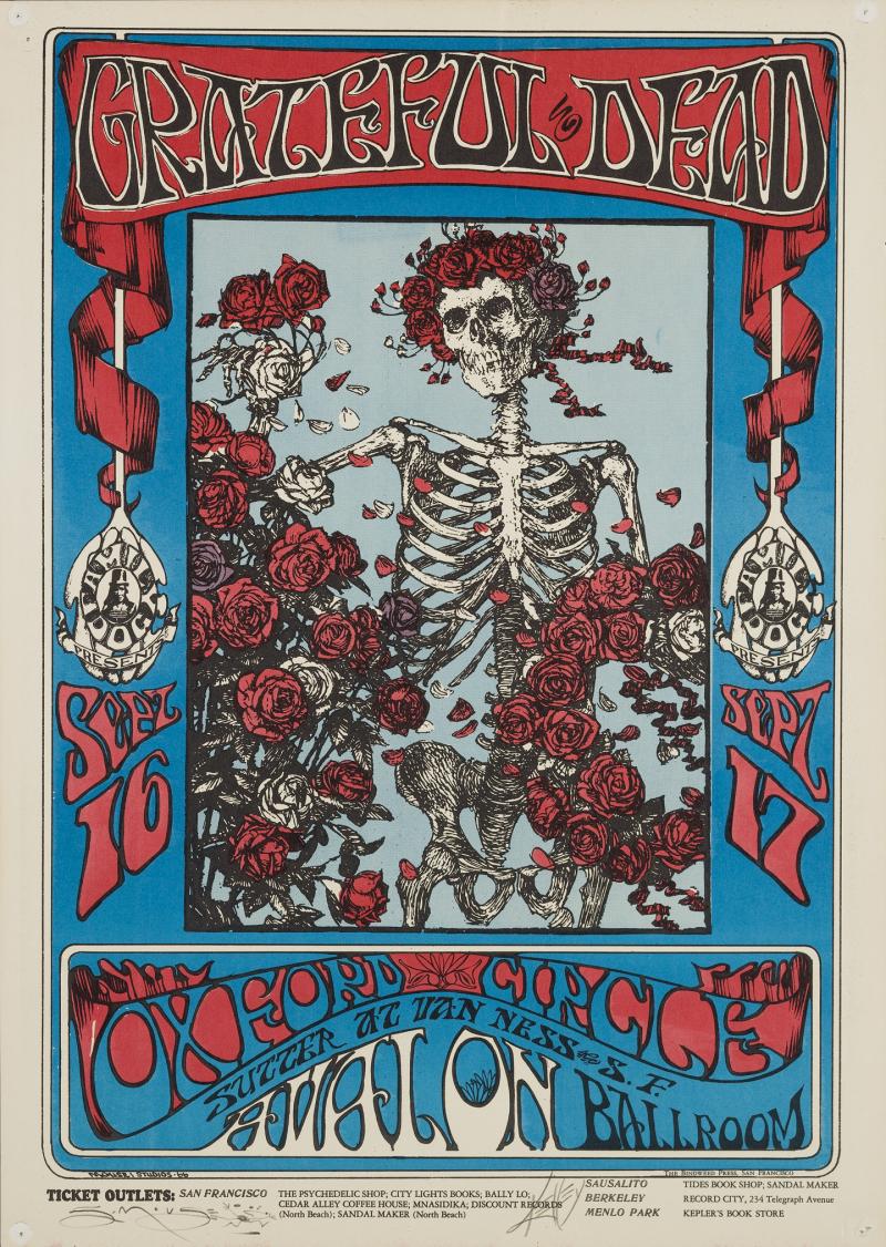
The main character of the tattoo comes from a cover of the "Grateful Dead" album. Released 50 years ago (in October 1971), it is generally known by the name "Skull and Roses" (due to its iconic art). They used for an album cover the legendary poster created for a Dead concert at the Avalon ballroom.
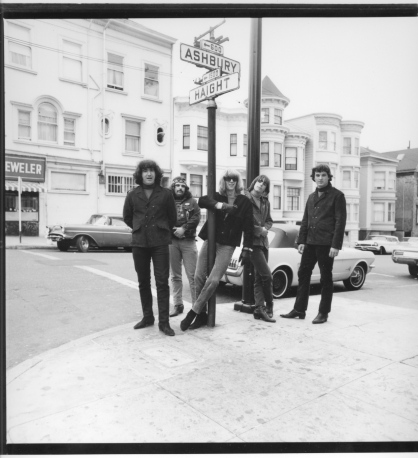
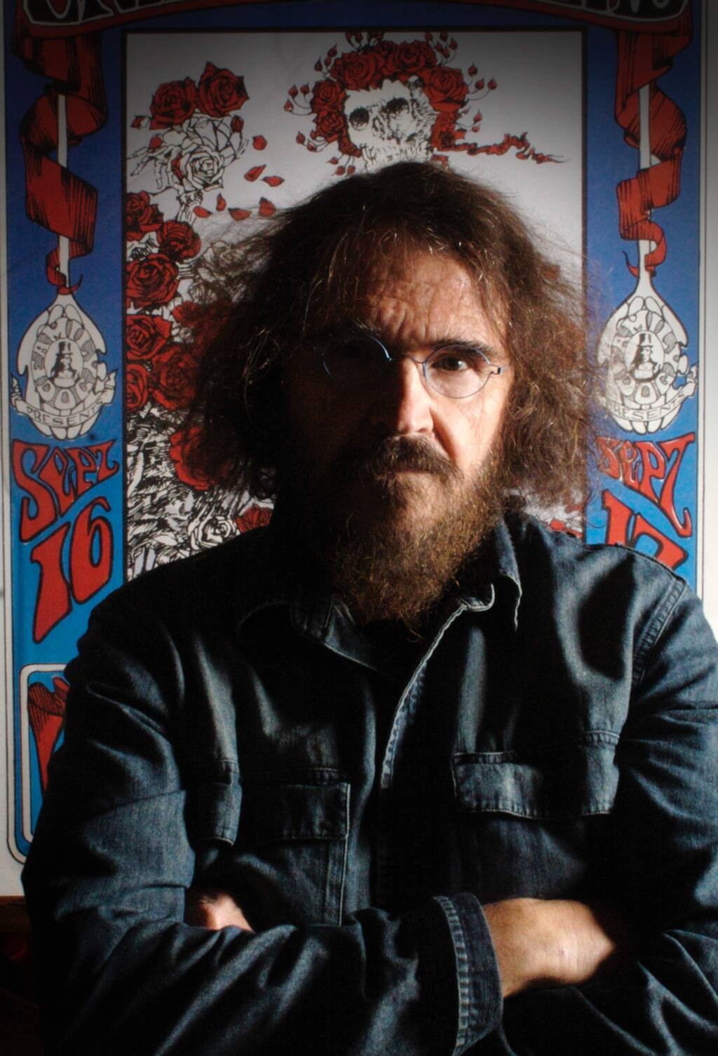
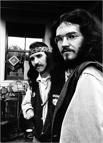
The poster was made through the collaborative efforts of two artists — Stanley “Mouse” Miller and Alton Kelley. While Mouse was responsible for lettering and drawing, Kelley usually chose the image they would use and laid out the design. While living in the Haight Ashbury during the mid-to late 1960s, Stanley Mouse designed album art for the Grateful Dead and Jefferson Airplane, and later for Journey and Steve Miller (the famous winged horse).
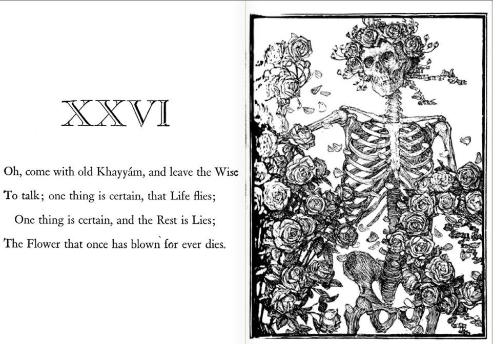
The two artists often worked with contemporary images, but also searched for images in art books and other illustrated texts from the past. The skeleton and roses on the iconic poster came from a 19th century illustration in the "Rubaiyat of Omar Khayyam", a book of 11th century Persian poems the artists discovered in the public library.
"Rubáiyát of Omar Khayyám" is the title that Edward FitzGerald gave to his 1859 translation from Persian to English of a selection of quatrains attributed to Omar Khayyam (1048–1131). By the 1880s, the book was extremely popular throughout the English-speaking world.
The book was illustrated by Edmund J. Sullivan, in a style that merged the British tradition of illustration from the 1860s with aspects of Art Nouveau.
